DÉJÀ VU:
REFLECTIONS OF CONFORMITY
FALL/WINTER 2026: FASHION FORECAST
THE ASK
Over the Fall 2024 semester, our team was tasked to create a 2-year forecast for Fall/Winter 2026, presented in 15 minutes or less.
The forecast had to be research-driven and design-centric, incorporating a cohesive theme, mood board, research from at least 15 sources, and forecasting theories all tying into the current and near-future zeitgeist.
THE TEAM
THE PROCESS
-
Each group was required to develop a cohesive and well-researched theme that served as the foundation for their forecast. The theme had to be supported by a mood board, research from at least 15 varied sources, and trend forecasting theories and methods. It needed to reflect contemporary influences and be justified through presenter notes with in-text citations.
-
The mood board needed to demonstrate strong design principles and curation, integrating on-theme and fashion-specific imagery. Additionally, a research map of influences had to extend beyond fashion figures and influencers, incorporating cultural, political, artistic, and technological drivers that shaped the theme.
-
Requiring 12 colors, presented across three moodboards:
A color palette slide with imagery to capture the overall mood.
Two color story slides, each featuring distinct palettes with supporting visuals. All colors needed a strong rationale, connecting them to the forecasted mood, market trends, and industry research.
-
Fabrics Forecast: 9-12 textiles categorized into innovative/trademarked fabrics, CottonWorks fabrics, and general textiles, each labeled and justified with real-world examples from the past 12 months.
Patterns & Prints Forecast: 3 patterns and 3 prints, each backed by visual examples and citations.
Details & Trims Forecast: 3 trims and 3 design details, emphasizing emerging construction techniques and embellishments.
-
Street Style: Three slides featuring three distinct looks, each with five researched and sourced street-style photos (not from editorial shoots or advertisements). Each look needed a unique name and had to be sourced from fashion events within the past year.
Runway Looks: Three slides featuring three distinct runway looks, with five fashion show references per look, emphasizing emerging silhouettes, styling techniques, and construction details.
Key Items: Three slides, each dedicated to an essential fashion item (e.g., outerwear, knits, tailored clothing), with five sourced examples per slide.
INTRODUCTION
Otherwise known as a dummy slide, our presentation opened up with this interview clip between artist Tyler, The Creator and Maverick Carter discussing homogenization in relation to the Music industry and its shift over time. Mentioning how in the early 2000s, many of the top-charting musicians sounded distinct, though as time has progressed, many of todays musicians sound the same— or Homogenized.
THE CENTRAL THEME
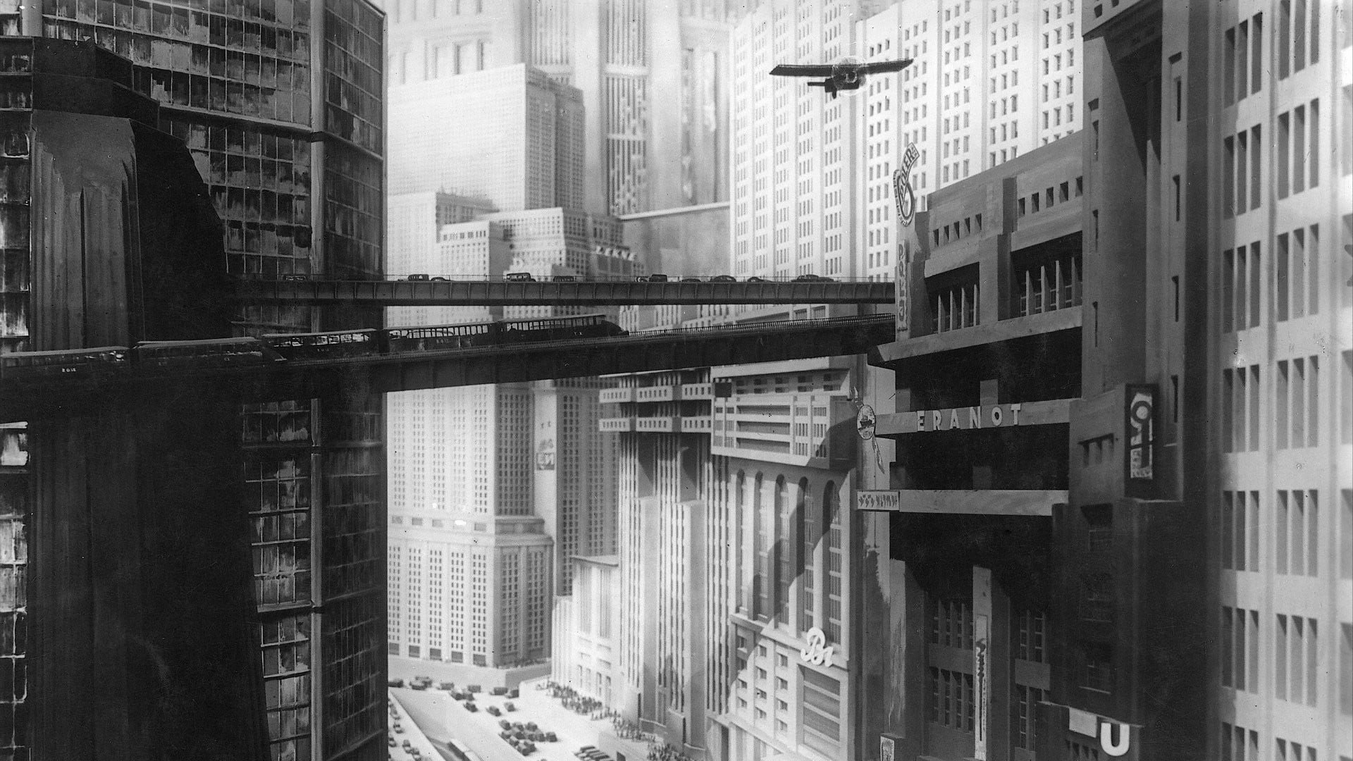
Deja Vu: Reflections Of Conformity, explores the tension between corporate-driven conformity causing mass homogenization. In a world dominated by corporate-driven sameness and rising authoritarianism, the fashion industry has become more about mass production and functionality, with creative expression becoming rare and difficult to access.
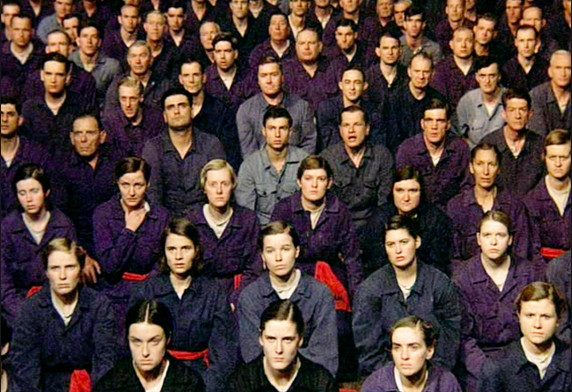
This theme is inspired by the dystopian atmosphere of George Orwell's 1984, but in this case, both government and corporations dictate choices. People conform through convenience and sameness, yet strive to reclaim individuality by remixing mass-produced items into unique styles, playing with silhouettes and personalizing their own styles to go against the grain.
This forecast captures that struggle, reflecting a world where consumers are moving away from chasing new trends and focusing on creative reinterpretation.
WHAT INFLUENCED THIS PROJECT?
INFLUENCES MAP
OUR INFLUENCES DRAW FROM A LANDSCAPE WHERE CONFORMITY AND REBELLION CLASH. AT THE BOTTOM, A STARK MARCH OF SILHOUETTES CROSSES A DESOLATE DESERT, GUIDED BY TYLER, THE CREATOR’S ST. CHROMA—A SYMBOL OF AMBIGUOUS LEADERSHIP, BALANCING GUIDANCE AND CONTROL. SIGNS MARK “CONFORM” TO THE LEFT AND “REBEL” TO THE RIGHT, REPRESENTING CHOICES IN A CORPORATE-DRIVEN WORLD.
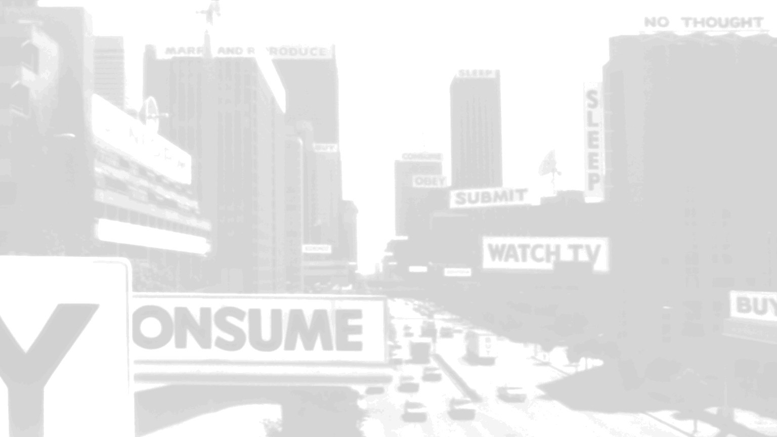
IN THE SKY, THE LEFT SIDE DEPICTS CONFORMITY: IMAGERY FROM JOHN CARPENTER’S THEY LIVE WITH ITS ICONIC “OBEY” COMMANDS, THE MONOPOLY MAN AS A SYMBOL OF CAPITALIST CONTROL, EYEBALLS ON TV SCREENS, AND A NOD TO TRUMP’S PRESIDENCY—ALL HINTING AT SURVEILLANCE AND MEDIA MANIPULATION.
AT THE CENTER, BIG BROTHER LOOMS—A METAPHOR FOR AUTHORITARIAN CONTROL AND MODERN CORPORATE OVERSIGHT.
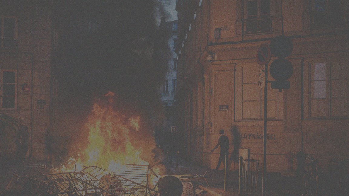
TO THE RIGHT, SYMBOLS OF RESISTANCE EMERGE: TV SCREENS DISPLAY RIOTS AND PROTESTS, ECHOING INDIVIDUALS RECLAIMING IDENTITY AND FREEDOM AMID A SYSTEM OF HOMOGENIZATION.
MOODBOARD
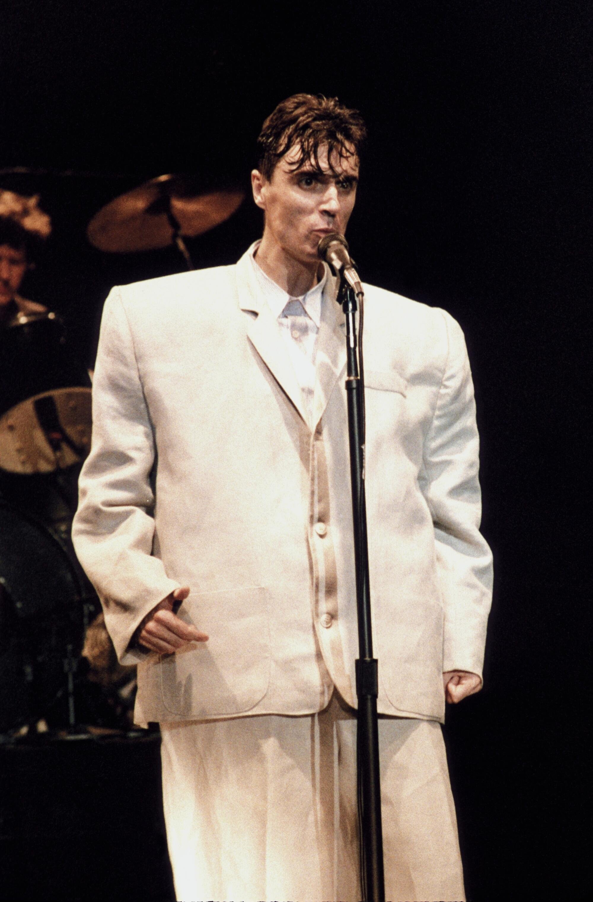
EXPLORING THE CLASH BETWEEN CONFORMITY AND REBELLION. A CHAOTIC CORPORATE CROWD COVERS THE LANDSCAPE, WITH ONE FIGURE HOLDING A NEWSPAPER HEADLINED FEAR—HIGHLIGHTING TODAY’S GLOBAL CLIMATE OF UNCERTAINTY. BIG BROTHER'S EYES SYMBOLIZE CONSTANT OVERSIGHT, AS SURVEILLANCE CAMERAS AND EYES LOOM THROUGHOUT. MILITARY-INSPIRED, OVERSIZED MENSWEAR SUITING REFLECTS AUTHORITARIAN UNIFORMITY, WHILE EXAGGERATED SILHOUETTES SUGGEST REBELLION—A DESIRE TO STAND OUT AMID CONFORMITY. REFERENCES INCLUDE THE LET’S START HERE ALBUM COVER BY LIL YACHTY AND DAVID BYRNE'S OVERSIZED SUIT IN STOP MAKING SENSE—BOTH SYMBOLIZING CREATIVE DEFIANCE AGAINST INDUSTRY STANDARD.
OVERALL
COLOR PALETTE
-
A CHAOTIC BLUR OF SOCIETY UNDER RULE, AND THE REBELLIOUS NATURE OF THE RECEIVERS. THE SURVEILLANCE CAMERAS WITH EYES WATCH THE CROWD, WHILE OVERGROWN STRUCTURES AND MOUNTAINS OF RUBBLE ACT AS A WALL TO EVOKE A SENSE OF CLAUSTROPHOBIA. A SCREEN COVERS VISION FROM WHAT THEY ARE ALLOWED AND NOT ALLOWED TO SEE, WHILE THE EYES REFLECT MASSES ALREADY CONFORMING TO IMPOSED STANDARDS. FROM THAT, THESE ARE THE COLORS THAT REPRESENT THE THEME OF CONFORMITY, CONTROL, AND INDIVIDUALITY.
COLOR STORY 1
REBELLION
-
“Rebellion” embodies society under authoritarian surveillance and mass corporate ruling. With burning money, a crowd of faceless individuals in matching jumpsuits, tall brutalist architecture covered with graffiti, all uncovered by a burning American flag. The dark and deep shades of red, green, purple symbolizes the struggles in a dystopian world with violence, survival and power of the human spirit to have a desire for freedom. Deep red is associated with passion, boldness, power, and danger. The warm shades of orange brown bring in the sense of individuals to keep their identity. Deep purple represents luxury, mystery, and spirituality. Subdued gray tone blended in with green and blue reflects a quiet form of rebellion and cautiousness.
COLOR STORY 2
CORPORATIZATION
-
“Corporatization” includes images of big brother, surveillance eyes, groups of individuals, and computers highlighting the corporate structures in the pursuit of power. The muted, industrial hues of gray and dark tones symbolizes corporate, uniformity and oppression, while the soft, earthy muted shade represents hints of individuality and the human spirit struggling from freedom. The gray represents sophistication, timelessness, and evokes the feelings of melancholy as the dark gray represents strong, stable, maturity, and formality.

TEXTILES
-
Reflecting the characterization of a shark within the corporate atmosphere as the whole persona of such aligns with this material. Sharkskin as a fabric is coined for its sleek and lustrous finish that reflects the work of the sharpness characterized by its user. From the persona, a “shark” is created aligned with the competitiveness, resilience, and hunger seen within the corporate atmosphere.
-
Polyester Twill once again reflects that corporate feel with it being one of the most used fabrics within office wear. The material is used in most office wear where practicality and uniformity tend to overpower individuality. This is a symbolization of the influence of corporatization on both fashion and everyday life.
-
Ripstop is seen throughout many mass-markets of military-inspired fashion following our theme of uniformity. Ripstop is tough and tear resistant, and durable seen within many mass-market and military-inspired fashion. These usages may represent its use for uniformity and its support in utilitarian corporate agendas.
-
Herringbone embodies our theme by blending the worlds of timeless professionalism through traditional usage of the zigzag pattern and individuality through its unique texture. Herringbone embodies the theme by blending timeless professionalism with subtle individuality. Its classic zig-zag pattern reflects corporate uniformity, while its unique texture symbolizes quiet rebellion that represents the mixture of the world between mass-produced fashion and personal expression.
-
For our trademarked textiles we chose Fortius™ to represent our theme by once again showcasing a subtle rebellion and by blending in to breakfree. With Fortius™ being trademarked by the trending brand Arcteryx the inclusion of such shows how one may be able to conform to trends while staying individualized through reflections of its tailored functions of abrasion resistance and flexibility.
-
TENCEL™ Lyocell Gabardine to reflect how corporations are seen branding themselves “green” in order to appeal to the environmentally conscious consumer with it being sustainable fabric.
PRINTS, PATTERNS,
TRIMS & DETAILS
-
OUR PRINTS EXPLORE THE TENSION BETWEEN CONFORMITY AND REBELLION. DESIGNED TO STAND OUT WHILE MAINTAINING STRUCTURE, THEY DISRUPT UNIFORMITY AND CELEBRATE INDIVIDUALITY. DISTORTED STRIPES CHALLENGE THE CLEAN LINES OF CORPORATE AESTHETICS, SYMBOLIZING INNER CHAOS AND RESISTANCE. THE SQUIGGLE PRINT OFFERS FLUIDITY AND SPONTANEITY, A DIRECT CONTRAST TO RIGID DESIGN. ZEBRA PRINT STRIKES A BALANCE BETWEEN CONTROL AND FREEDOM—BOLD, ORGANIC, AND UNAPOLOGETIC.
-
OUR PATTERNS DRAW FROM TRADITIONAL SUITING, INFUSING SUBTLE REBELLIONS INTO CLASSIC CORPORATE STYLES. HOUNDSTOOTH EVOKES HERITAGE AND STRUCTURE, YET ITS REPETITION INVITES MODERN INTERPRETATION. PINSTRIPES CONVEY AUTHORITY WHILE OFFERING A MINIMALIST CANVAS FOR INDIVIDUAL EXPRESSION. GLEN PLAID BALANCES ORDER AND COMPLEXITY, SYMBOLIZING THE HIDDEN LAYERS OF PERSONALITY WITHIN UNIFORMITY.
-
OUR FORECASTED TRIMS AND DETAILS REIMAGINE CLASSIC ELEMENTS TO SUPPORT INDIVIDUAL EXPRESSION. OVERSIZED POCKETS OFFER ENDLESS VARIATION, TRANSFORMING A FUNCTIONAL ELEMENT INTO A STATEMENT OF PERSONAL STYLE. UNTRADITIONAL BUTTONS—EXAGGERATED IN SIZE OR PLACED UNEXPECTEDLY—DISRUPT UNIFORMITY AND CHALLENGE CORPORATE CONVENTIONS. OVERSIZED COLLARS AND LAPELS NOD TO THE ZOOT SUIT MOVEMENT, SYMBOLIZING REBELLION THROUGH DISTORTED PROPORTIONS THAT CONFRONT IDEAS OF “PROPER” DRESS. EACH DETAIL PUSHES AGAINST TRADITION, EMBRACING BOLDNESS AND INDIVIDUALITY.
RUNWAY & STREET
LOOKS
-
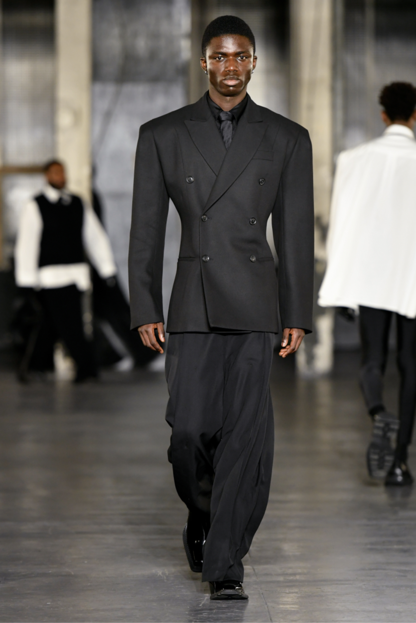
The first look is titled “STOP MAKING SENSE”, the look is inspired by the corporate-driven conformity part of our theme as well as rebellion. It was also inspired by David Byrnes “Stop Making Sense”: his band talking heads, an band from 80s were pressured by labels to go more commercial (Byrne, D. 1984. Stop Making Sense). The band replied by making a concert film called “STOP MAKING SENSE” where the lead Byrne wore a large and boxy suit to mimic label pressures. An oversized boxy silhouette dominates the look, that features oversized square shoulders and an oversized jacket that is reminiscent of a grandpa's coat–both a nod to power dressing and Zoot Suits. The dressy office wear look conveys a sense of conformity as if the wearer is blending into the system however, there is signs of rebellion in the styling due to the proportions, which reflects to oneself breaking through the mold. The design of this look reflects the rigid structure of corporate culture where the world built on sameness and predictability.
-
Our last runway look is titled “JUMPSUIT” the look is characterized by a streamlined silhouette, it has a uniform-inspired aesthetic, almost seamless in its construction. The designs blur the line between functionality and high fashion while symbolizing corporate conformity. Monochromatic tones reinforce minimalist approaches, the colors are meant to give way to utilitarian simplicity. The look also draws inspiration from like likes of jumpsuits from the book 1984 by George Orewell
-
Our first street look is titled “WHAT ARE YOU HIDING”, it draws inspiration from the desire to remain unseen in a corporate-driven homogenized world. This look embodies the desire for anonymity and a quiet rebellion, the looks feature a full-length dark trench coat that engulfs the wearer in mystery. The trenchcoat, a staple of both authority and subversion, symbolizes both assimilation into, and defiance of the system. Brow-line shades add a futuristic, almost dystopian feeling, blurring one's identity while reinforcing the theme of hidden resistance.
This look transforms its anonymity into power. showcasing ones the disappearance from the corporate eye while reclaiming individuality. It’s a look that hides in plain sight, embodying the tension between blending in and standing out in a world ruled by sameness.”
-
The final runway look is called “UP IN ARMS”. This look challenges the structure of corporate conformity while embracing bold minimalism. The look includes sleeveless tops that expose a raw, unapologetic silhouette. The sleeveless design emphasizes sharp tailoring and the bodies structure, representing both vulnerability and strength. Inspired by a desire to break free from corporate frameworks, this look rebels against the notion of covered anonymity often seen in corporate-driven fashion. Instead, our look showcases the human form, rejecting conformity through absence of sleeves, which casts off the constraints of traditional office wear.


